
Sol Union
Nonprofit Project
Otis 2021
This nonprofit project was the culmination of the course for Logos and Letterforms in 2021. I chose to develop a nonprofit focused on environmental matters.


Process
At the time of this project's development, I had seen the positive impacts that a lack of traffic and active industry had on the environment because of the Covid-19 pandemic. Emissions and traffic drastically reduced during this time and the environment began to heal. With this in mind, I wanted to develop a company that would continue to address these matters.
I began by pulling together inspiration from images and preexisting brands that I admired: REI Co-Op, Patagonia, North Face, Ten Tree, and Urth. I wanted a comprehensive brand that could develop programs for the earth as a whole. I divided these into three simple sub-sets: air, earth, and water. Elements from the logo could be pulled and used independently to emphasize these programs and the nonprofit as a whole.
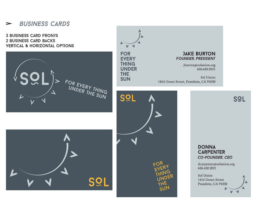
The colors used evoke a calming, un-aggressive feel to the brand. I chose a soft blue-gray and yellow as the primary colors because of the imagery of the sun, the basis of the logo's mark, whose contrast would work together. Additionally, combinations and altered shades of these colors could be used as secondary and tertiary colors.
The primary font selected is Baron, a geometric sans serif font with combined ligatures alternative capitals. The alternative capital "A" was used to create the spokes of the logo's sun; the "~" under the "O" was used as a mark for water-based programs and the "O" itself was used for air-based programs. Therefore, the elements of the nonprofit's programs are all nested within the primary logo.
Spectral is the secondary font used and was chosen for its versatility and modern-but-approachable look. With a bold to light weight range, the font could be used for everything from headlines to bodies of text.
The mockups created were chosen because of their relevance to the nonprofit's mission: to care for everything under the sun. With a focus on sustainability and eco-friendly products, while still recognizing the need/demand for branded products, I chose items that were reusable and would reflect the nonprofit's programs.